Noah Medical

Design system

Galaxy design system

Led the creation of Galaxy’s end-to-end design system, standardizing 100+ UI components to enhance consistency and streamline cross-functional collaboration. Improved design and development speed by creating a single source of truth, aligned with usability best practices.

About Galaxy

Galaxy is a surgical robot that allows for more accurate and less invasive lung cancer biopsies. It was the platform that I worked during my time at Noah Medical.

The issue

The Galaxy UI lacked a centralized design system. Designers relied on outdated files and screenshots, leading to inconsistencies in components, colors, and typography.

This lack of structure made scaling the design difficult and resulted in inefficiencies across teams.

The goal

Establish a single source of truth for the Galaxy UI by mapping every color, icon, font, and component.

Provide clear design system guidelines for designers and developers, ensuring consistency and scalability.

The result

I created a complete design system with over 100 elements in Figma. This enabled us to build the first Galaxy full workflow map.

Together, they increased the efficiency of the design team, sped up designs and developer handoffs, and improved the consistency of the system. Other teams benefitted from it as well by having a single source of truth to reference.

Mapping the foundations

I began by auditing the existing UI, cataloging colors, typography, and spacing. This process revealed inconsistencies, which I addressed by analyzing the component's purpose and constraints. Using design tokens, I documented styles and usage to create a flexible and maintainable foundation.

Example:

Base token:

Russian-ink-100

Syntax token:

Clickable-dark

Building the component library

With the base blocks defined, I designed each component used in the system, highlighting the properties that could be changed in each of them. I arranged them in a layered structure, showing first base elements, then components (which used the elements), followed by the modules (that were built with the components), and finally full page template layouts. In total, I created 50+ Figma components, with 2-10 variants each, and 100+ elements, among colors, fonts, and icons.

Elements

The base layer. Consisted of colors, typography, and icons.

Components

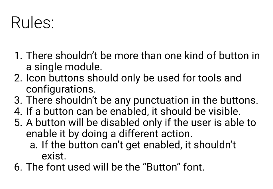
The lowest level that appeared by itself in the UI. Consisted of buttons, sliders, toggles, rows, etc.

Modules

Formed by using multiple components and elements. Consisted of tables, alert structures, menus, target cards, etc.

Templates

Used for reference. It showed how pages were organized, with emphasis on spacing and behavior.

Ensuring adoption

This project would only be useful if it was adopted. Therefore, I prioritized usability by tailoring it to both key user groups:

For designers, I created clear indications of what could be changed in each component and rules for their use.

For developers, I wrote detailed specifications and behavioral rules for seamless implementation.

Full workflow map

The design system enabled us to create a master workflow map, illustrating the entire Galaxy interface, including page connections and overlays. Collaborating with the systems engineering team, I integrated backend behavior details, making it an invaluable tool for engineering, product management, clinical engineering, and marketing.

This transformed cross-functional collaboration, eliminating guesswork and significantly improving efficiency.

Next: EM health indicator